
Album
Crafters
Un sistema de marca modular y adaptable.
Una marca, muchas audiencias.
Album Crafters necesitaba una identidad capaz de hablarle a públicos muy distintos —desde adolescentes hasta clientes corporativos— sin fragmentarse en cinco marcas diferentes.
El reto no era dibujar un logo: era diseñar un sistema con reglas claras que permitiera al equipo producir piezas coherentes mucho después de mi entrega.
One brand, many audiences.
Album Crafters needed an identity able to speak to very different audiences — from teenagers to corporate clients — without splintering into five separate brands.
The challenge wasn’t drawing a logo: it was designing a system with clear rules so the team could keep producing consistent work long after handoff.
Del isotipo al sistema.
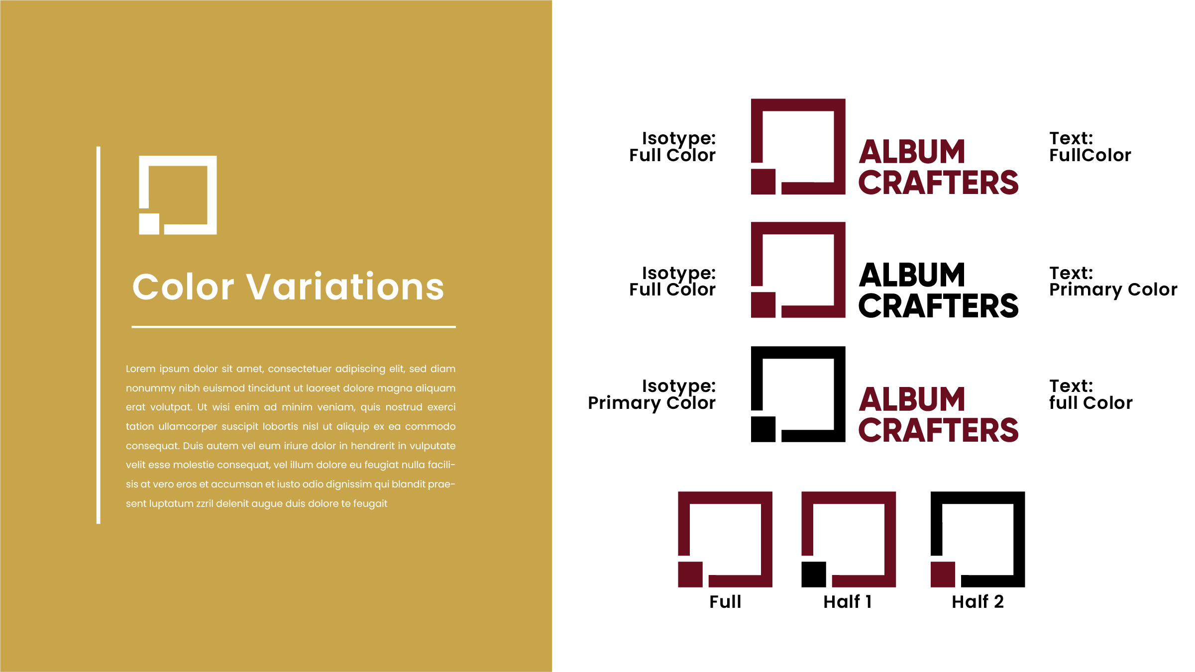
Partí de un isotipo geométrico minimalista —cuadros entrelazados— que funciona en cualquier escala y mantiene personalidad incluso a tamaño favicon.
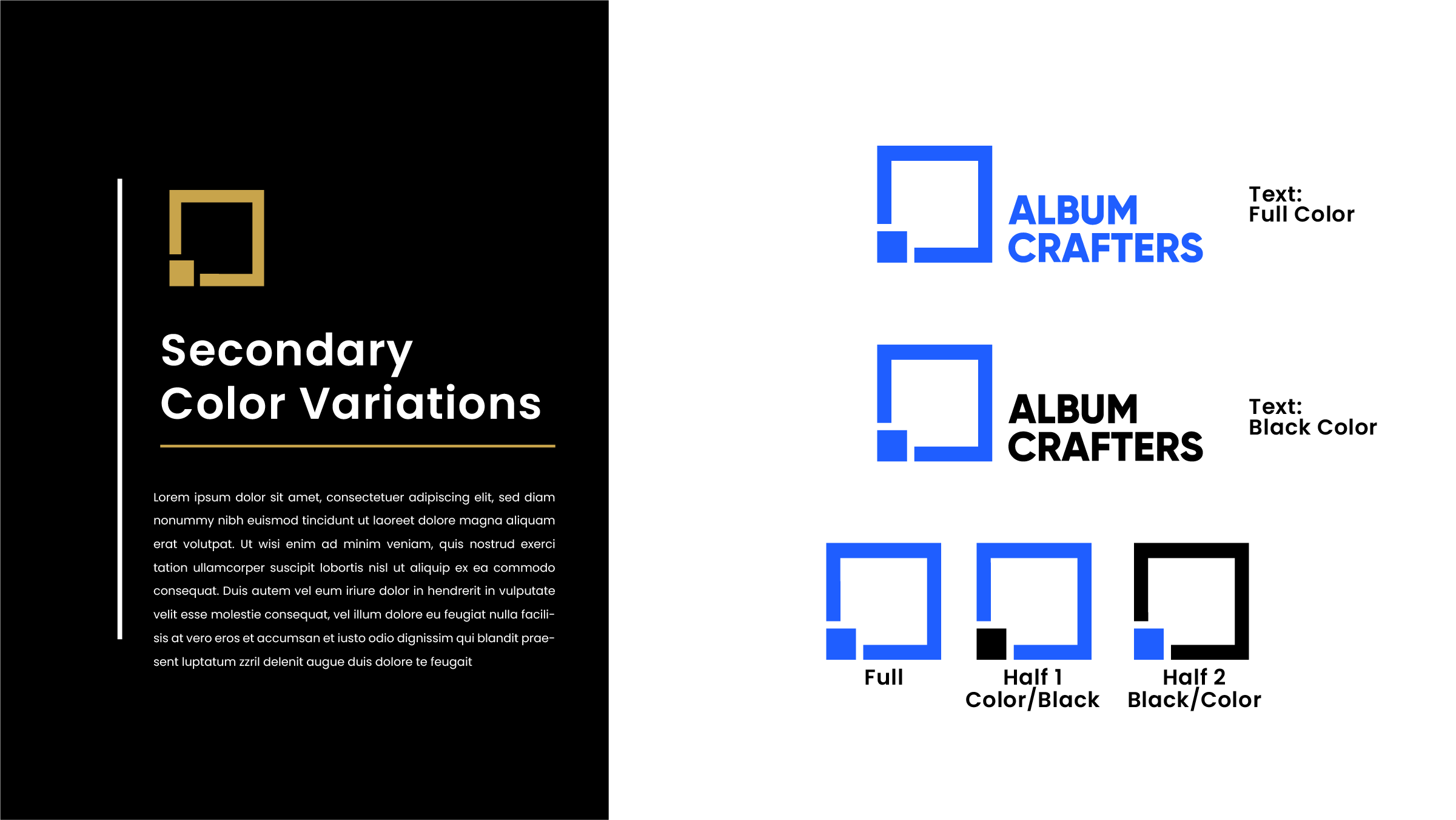
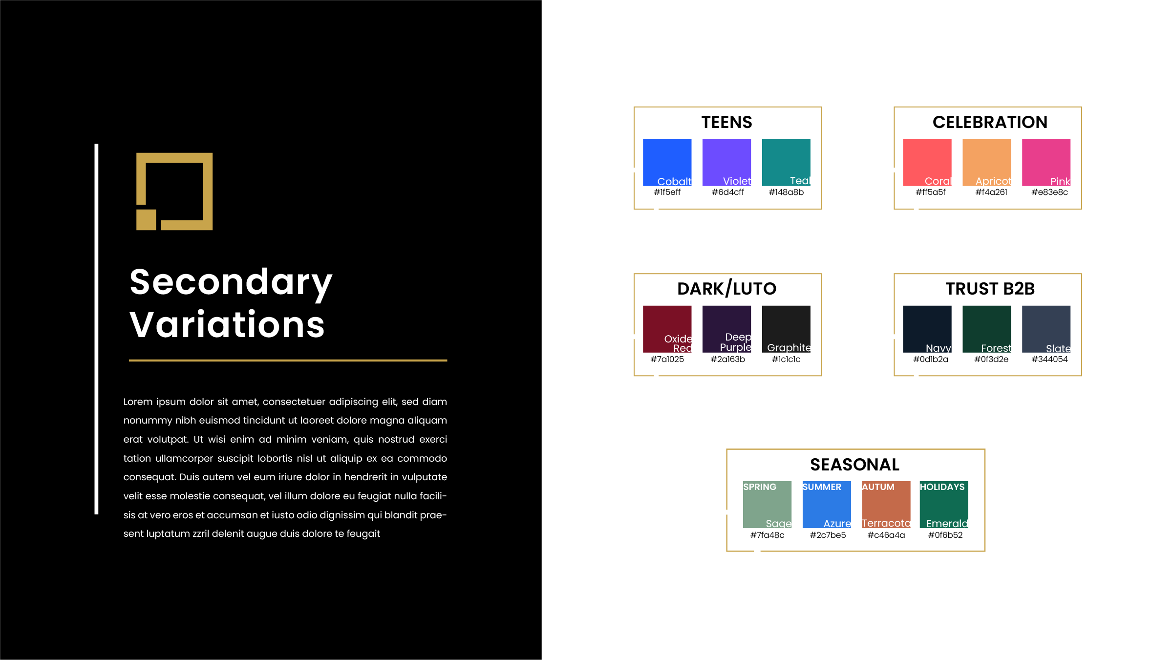
Sobre esa base construí un sistema de paletas estratégicas: cinco direcciones cromáticas pensadas para audiencias concretas — Teens, Celebration, Dark / Luto, Trust B2B y Seasonal. Cada paleta cambia el tono sin romper la marca.
Todo quedó documentado en un brand book de 14+ páginas: variaciones del logo, color, tipografía y aplicaciones.
From mark to system.
I started from a minimal geometric mark — interlocking squares — that works at any scale and keeps its personality even at favicon size.
On that base I built a strategic palette system: five colour directions designed for specific audiences — Teens, Celebration, Dark / Mourning, Trust B2B and Seasonal. Each palette shifts the tone without breaking the brand.
It was all documented in a 14+ page brand book: logo variations, colour, typography and applications.
Qué entregué
- 01Isotipo y variaciones de logo
Versiones principal, horizontal, monocromática y reducida.
- 02Sistema de 5 paletas estratégicas
Teens, Celebration, Dark/Luto, Trust B2B y Seasonal.
- 03Brand book de 14+ páginas
Reglas de uso, tipografía, color y aplicaciones.
- 04Kit de aplicaciones
Plantillas listas para producción del equipo.
Las 5 paletas estratégicas
Cinco variaciones cromáticas modularizadas para adaptar la marca a audiencias específicas.
Una marca que escala sola.
Album Crafters quedó con una identidad que se adapta sin diluirse: el mismo isotipo, cinco tonos, una sola marca reconocible.
Más que un logo, el cliente recibió un sistema de decisiones — la diferencia entre una marca que envejece bien y una que hay que rehacer cada temporada.
A brand that scales on its own.
Album Crafters ended up with an identity that adapts without diluting: the same mark, five tones, one recognizable brand.
More than a logo, the client received a decision system — the difference between a brand that ages well and one that has to be redone every season.